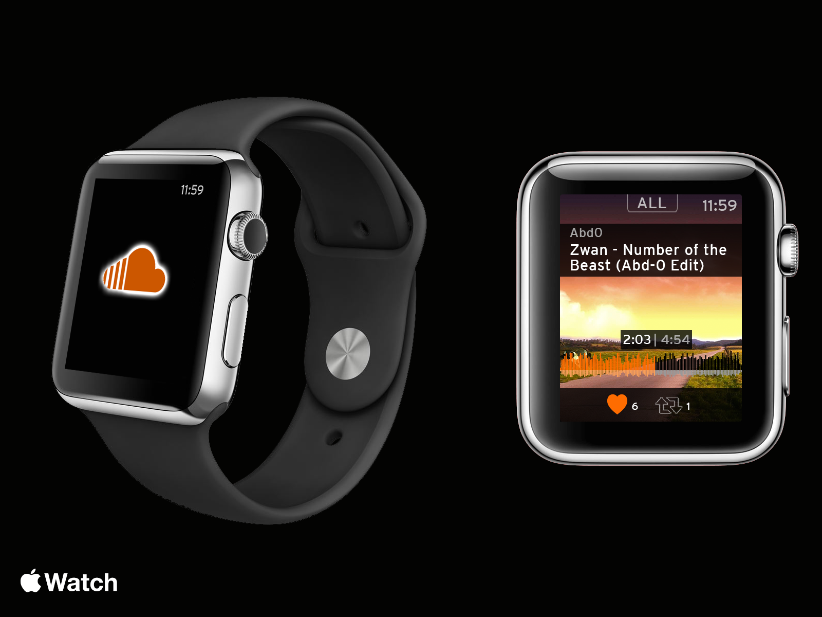
How would SoundCloud look like if it were adapted for the anticipated Apple Watch?
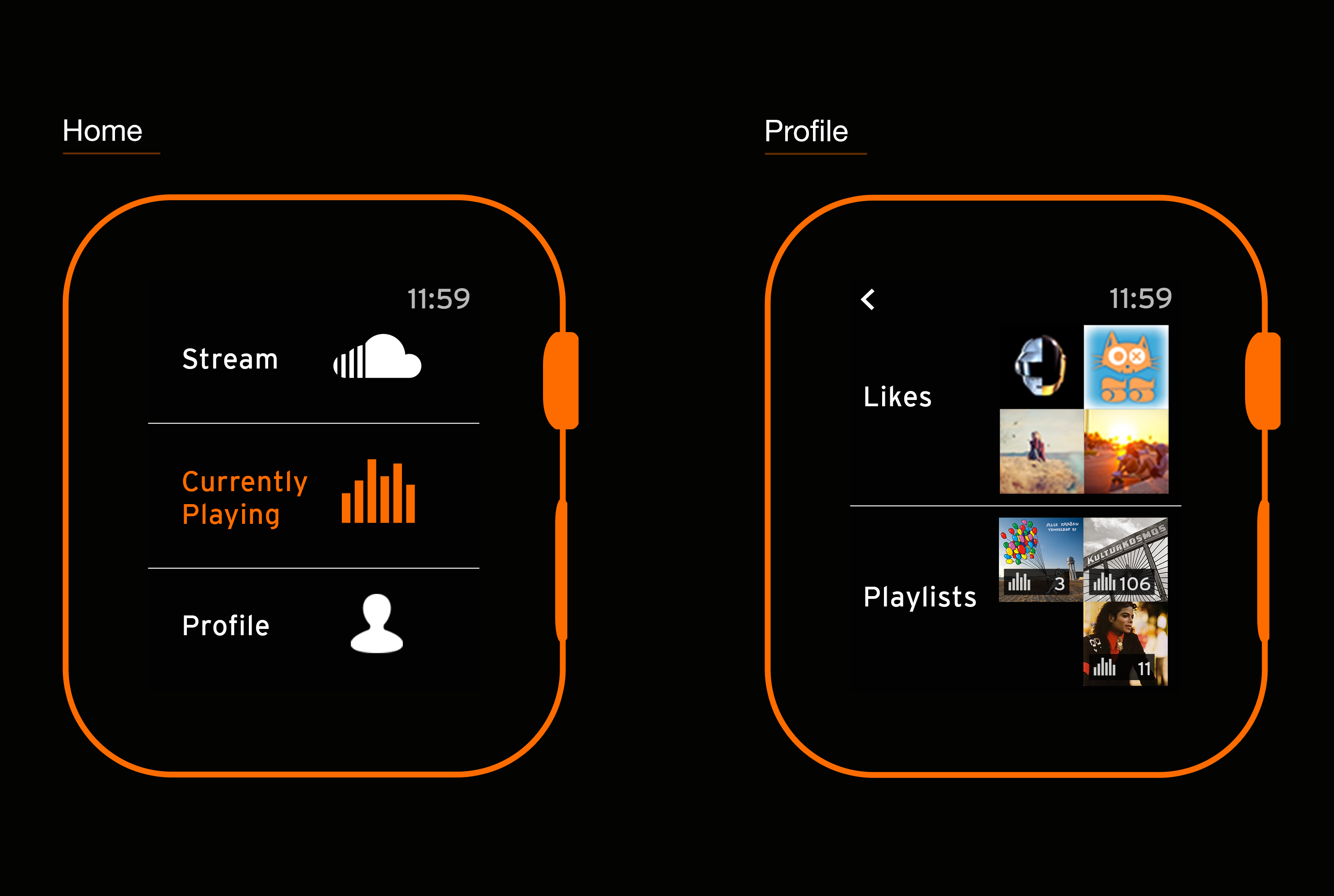
I love SoundCloud, and if I would ever wear a smart watch (such as the Apple Watch), I would love to see a well designed and easy to use SoundCloud app on it. This 2-day side project is an attempt at a redesign for the anticipated Apple Watch.
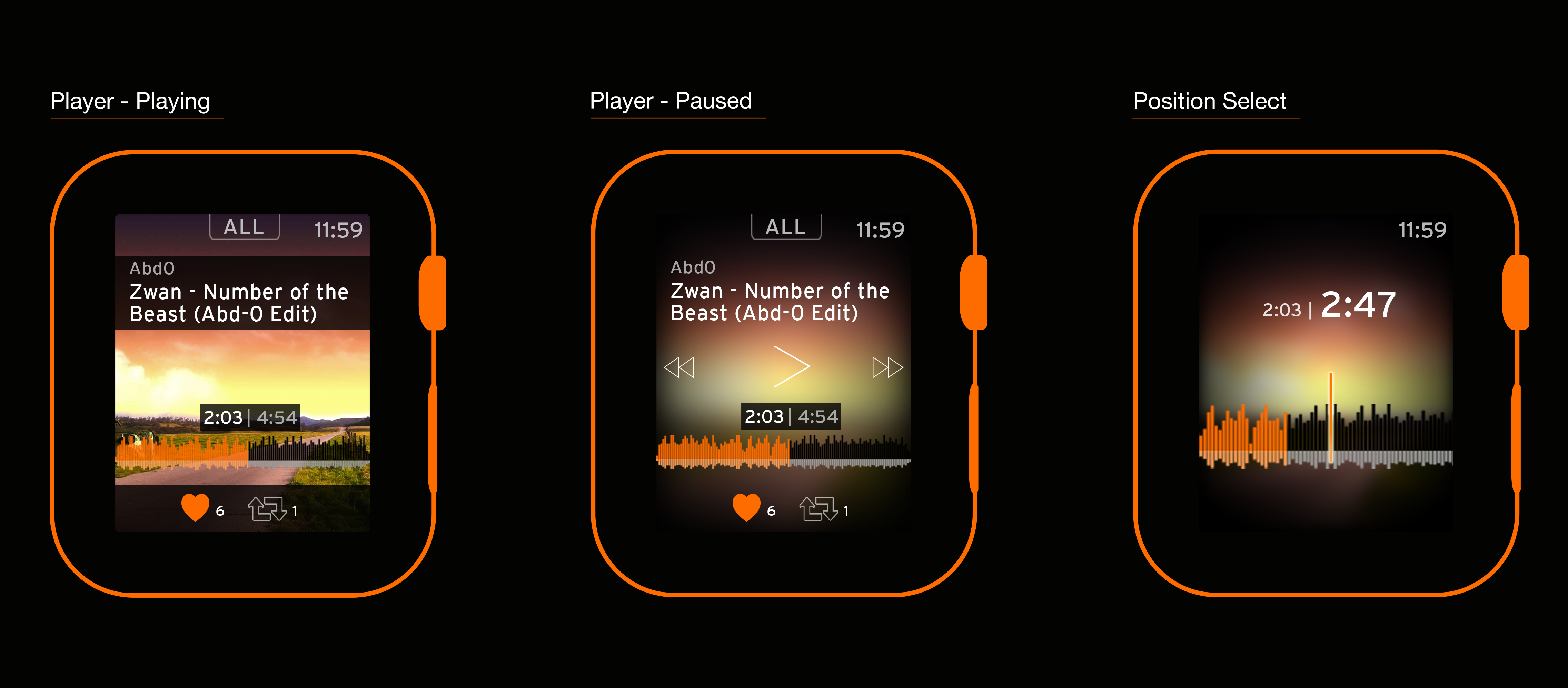
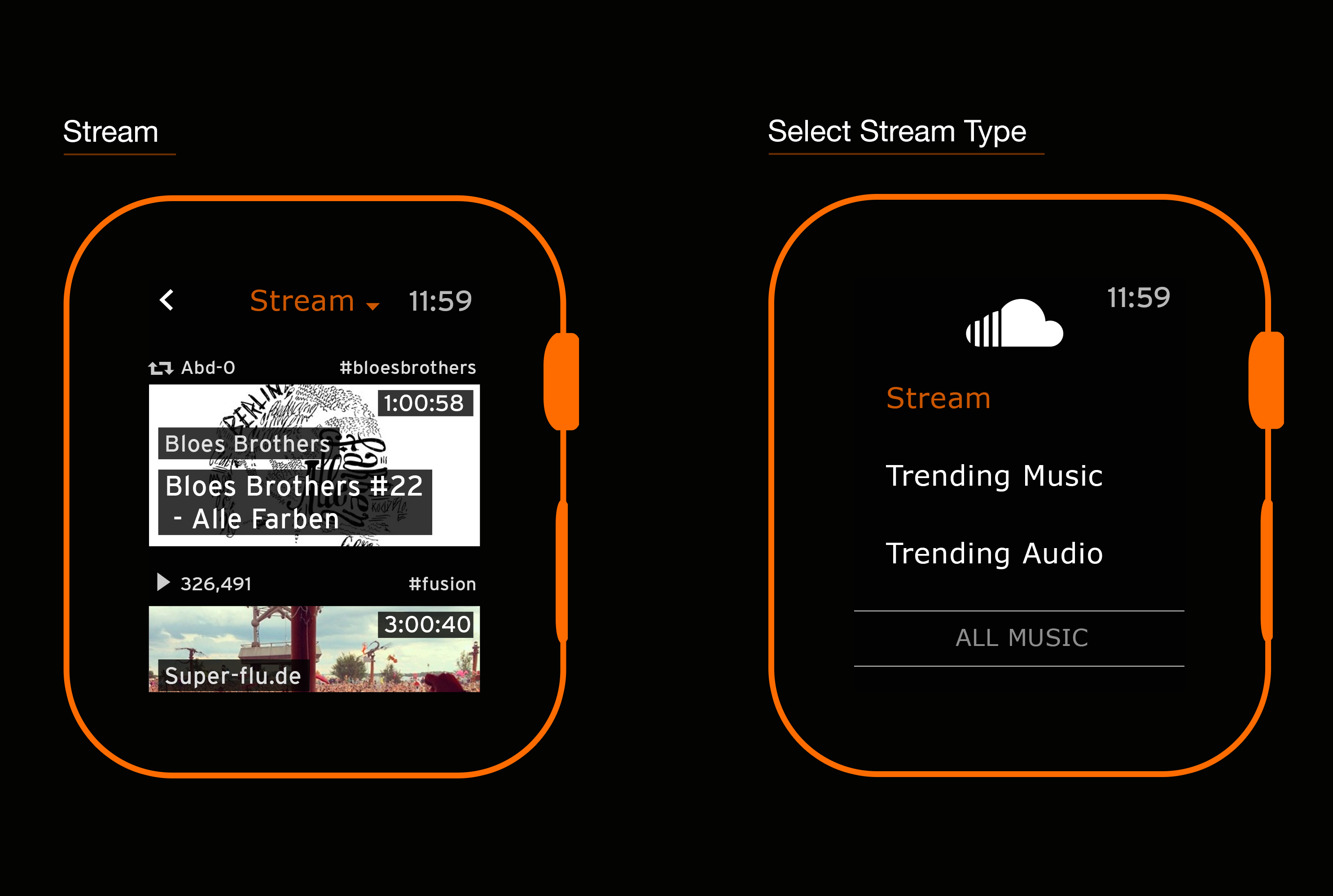
In this concept, I've placed emphasis on keeping the favoriting/reposting feature readily available, and also on showing track duration in the stream view. This is due to how I use SoundCloud while on the go:
1) I sometimes avoid longer podcasts and usually skip over preview tracks, so track duration is a must.
2) If a song initially appeals to me, I'll just favorite it and move on, and later listen to my recently liked tracks to handpick the best ones.
SoundCloud for the tiny screen...
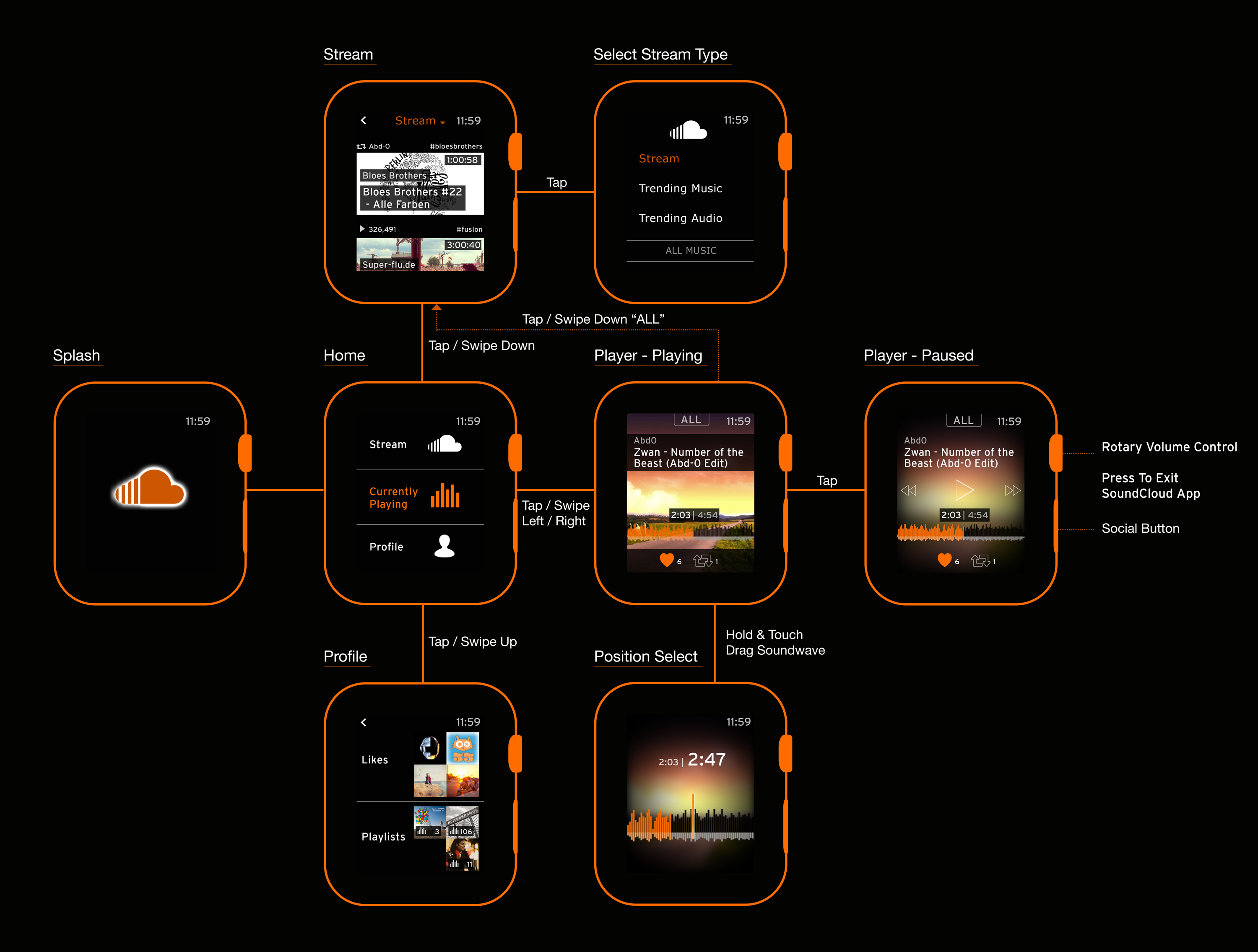
A simple swiping interaction model.
Credits:
Thanks to Impekable for the Apple Watch GUI template, Francesco Scalambrino for the Apple Watch showcase template, and Thomas Budiman for the SoundCloud player app template.